I must begin by saying that I wasn't at the shows, unfortunately I had some apointments that I couldn't cancel in order to attend International Designer Mexico. However, my press acreditation allowed me to acces the photo archive where I got the chance to take a look at the collections and create the collages that I'm showing you. By not being at the shows you can't judge them by the rythm of the models, or the soundtrack, and you don't also know their inspirations and background of each collection, so whatever judgement are here written are only of the clothes and the collections alone.
I also want to say that I don't really like blogs reviewing collections, because there are fashion journalists which do it as a job, and do it better. Suzy Menkes, Cathy Horyn, Sarah Mower or Tim Blanks, to mention a few, are experts that have such a vast knowledge and when doing a review their decades of fashion background allowes them to do it right. In Mexico though, we don't have this kind of careers and people in charge of reviewing the collections, and the few that do, often miss the point and don't really criticize from an objective point of view. Since I'm reviewing something from Mexico, I will make the posts in both languages. Thanks to IDM for the photo material, all credits go to them.
Check their official site here.
If you click on the designer's name you can see their profile on IDM and their way to contact them.
Quiero comenzar por decir que yo no fuí a los shows, desafortunadamente tuve compromisos en Cuernavaca que no pude cambiar, así que no fuí a IDM. De cualquier manera, saqué una acreditación como prensa y eso me permitió obtener las fotos del archivo del evento y de ese modo pudé tanto ver las colecciones como hacer los collages que comparto con ustedes. Es importante decirlo porque al no estar en los shows no puedes criticar otros aspectos de los desfiles además de la ropa como el ritmo en el que salen las modelos, el soundtrack y mas importante la inspiración o la explicación que da un diseñador de su colección. Por eso solo me limito a criticar la colección sola.
También quiero decir que no me gustan los blogs que hacen repaso o critica de colecciones porque existen en el mundo periodistas de moda, que tienen muchísimo más conocimiento y experiencia que nosotros los bloggeros. Simplemente tener décadas haciendo su trabajo y viendo moda, les permite hacer una critica mejor informada y con muchas más referencias. En México desafortunadamente, los pocos periodistas de moda no hacen un repaso de las colecciones via Internet, a veces se llega a criticar por medio de revistas y un poco tarde y los que lo hacen en Internet, sinceramente, no los considero objetivos ni críticos en verdad del trabajo de los diseñadores. Gracias a IDM por el material fotográfico.
Si gustan pueden checar el sitio oficial del evento aquí.
Al dar click en el diseñador pueden ver su perfíl en IDM y ver como contactarlos.
Cherry Project
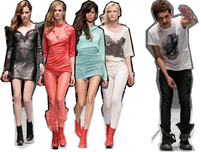
Jonathan Morales diseña Cherry Project, una línea que siempre ha sido orientada a las jóvenes. Su ropa es siempre sexy y es favorita de las celebridades adolescentes en México. Para otoño escogió una paleta ligera excepto por algunos looks en negro al inicio. El resto incluía rojo, rosa, aqua y blanco. La figura creada fue repetida en los diferentes colores por todo el desfile. Todos los pantalones eran skinny y las minifaldas muy justas, se logro un balance con el uso de playeras más amplias y largas que tenían frases impresas. En otras playeras, faldas y pantalones habían aplicaciones de piel de las que salian correas, dando la impresión de ligueros. Los zapatos fueron botines sin punta en los mismos colores y quedaron muy bien. Mi pieza favorita de la colección fue un vestido negro con hombros en punta (lo que me pareció passé) pero la tela era una especie de brocado- reptilesco dando un muy buen efecto. La única falla fue que vimos el mismo look muchas veces, y los colores noe ran adecuados para otoño, me hubiera gustado ver algunas piezas propias de la temporada en su estética.

Andres Jiménez desigs Mancandy, a label which is always earthy, light, in soft natural materials, that are perfect for wearing, specially during the day. This collection was called "Mendigo", beggar or vagabond in english, so the pieces were great outerwear styled in layers to give that homeless look in a polished way, making it pop with nice fur and bones one of a kind accesories. The long bermuda shorts, capes, parkas, jackets and coats were great wearable options for next fall, specialyl adapting to Mexico since they are not for extreme cold. Colors were great for fall, dark blue, olive green, cream, beige and nude made nice wardrobe options. One of the best looks had a long skirt that went all the way to the floor. However the show had the worst continuity in the outfits that were sent down the runway, some where all layers and some where polished minidresses, that had nothing to do with the rest of the collection. The stilyng was definitely the problem if some of those looks where completed sith layers, it would have been much more interesting visually.
Andres Jiménez diseña Mancandy, una firma que siempre hace ropa ligera, en materiales naturales perfectos para usarse en especial, durante el día. La colección se llamó "Mendigo", así que las piezas fueron acumuladas en capas para dar un aspecto de indigente pero de una manera muy bien trabajada y pulida, haciendo uso de accesorios únicos hechos de pieles y huesos para resaltar los atuendos. Hubieron muy buenas bermudas, chaquetas, abrigos, parcas y capas, que ofrecen una buena opción y aparte se adaptan al otoño en México el cual no es en extremo frío. Fue una buena elección de colores para la temporada, hubieron verdes olivo, azules oscuros, tonos crema, beige y piel. Uno de mis looks favoritos incluia una falda que llegaba hasta el suelo. A pesar de todo, la coleccion tuvo muchos problemas de continuidad, habían looks llenos de capas y habían minivestidos cortos que nada tenían que ver con el resto de la colección. El problema fue la manera en que se estilizo, con mas prendas encima, los minivestidos y la simple camisa con pantalon, hubieran sintonizado mejor con lo demás.
Andres Jiménez diseña Mancandy, una firma que siempre hace ropa ligera, en materiales naturales perfectos para usarse en especial, durante el día. La colección se llamó "Mendigo", así que las piezas fueron acumuladas en capas para dar un aspecto de indigente pero de una manera muy bien trabajada y pulida, haciendo uso de accesorios únicos hechos de pieles y huesos para resaltar los atuendos. Hubieron muy buenas bermudas, chaquetas, abrigos, parcas y capas, que ofrecen una buena opción y aparte se adaptan al otoño en México el cual no es en extremo frío. Fue una buena elección de colores para la temporada, hubieron verdes olivo, azules oscuros, tonos crema, beige y piel. Uno de mis looks favoritos incluia una falda que llegaba hasta el suelo. A pesar de todo, la coleccion tuvo muchos problemas de continuidad, habían looks llenos de capas y habían minivestidos cortos que nada tenían que ver con el resto de la colección. El problema fue la manera en que se estilizo, con mas prendas encima, los minivestidos y la simple camisa con pantalon, hubieran sintonizado mejor con lo demás.
Te Amo
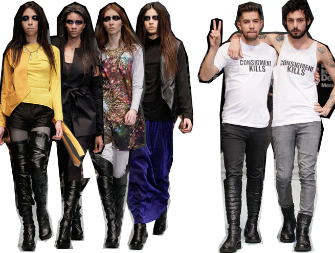
Rafa and Roberto have established themselves in the small world of fashion in México as one of the most experimental and alternative brands. Their subject of inspiration are usually dark and gothish. For fall they chosen an almost complete black palette with a few pieces of canary yellow and a more mustard tone, vibrant blue-purple, the regular soft grey, and a colorful print of a constelation. If you separate the pieces, they are strong enough to stand out on its own and are really interesting, with a cool factor that is aimed to youth succesfully, the yellow skirt of the opening look, the black jackets with the ripped shoulders and the shortened tee with the hands could be bestsellers. The collection as a whole, was a little disappointing. I just wish I could see more play with color, using bright hues with black it's always safe, and even when the constelation print came out it was either styled with the same print for an overall look or again with black, or gray. Although the clothes are fresh I question if they have any theory of color. The other thing were the boots, which are incredibly similar to Rodarte.
Rafa y Roberto se han establecido en la pequeña industria del país como como una de las marcas mas creativas y experimentales. Sus temas de inspiración siempre son oscurones y medio góticos. Para otoño escogieron una paleta casi negra total con algunas piezas en amarillo canario y otro tono mostaza, asi como azul tornasol, su clásico tono gris claro y un estampado con muchos colores de una constelación. Si separas las piezas, tienes ropa que por si sola puede ser interesante y de propuesta fuerte, destinada a un sector joven exitosamente, piezas como la falda amarilla que abrio el desfile, las chaquetas sin hombros con mangas que comienzan abajo y la playera corta de las manos, pueden ser en verdad vendibles. En concreto la colección me decepcionó un poco y esque me gustaría ver más juego de color, escoger dos o tres tonos vibrantes y combinarlos con negro siempre es una apuesta demasiado segura, hasta cuando salió el estampado de constelación iba estilizado en un look total con el mismo estampado o con más negro. La ropa se ve fresca y nueva pero en verdad cuestionó su teoría de color. No puedo dejar pasar también que las botas eran como las de Rodarte.
Rafa y Roberto se han establecido en la pequeña industria del país como como una de las marcas mas creativas y experimentales. Sus temas de inspiración siempre son oscurones y medio góticos. Para otoño escogieron una paleta casi negra total con algunas piezas en amarillo canario y otro tono mostaza, asi como azul tornasol, su clásico tono gris claro y un estampado con muchos colores de una constelación. Si separas las piezas, tienes ropa que por si sola puede ser interesante y de propuesta fuerte, destinada a un sector joven exitosamente, piezas como la falda amarilla que abrio el desfile, las chaquetas sin hombros con mangas que comienzan abajo y la playera corta de las manos, pueden ser en verdad vendibles. En concreto la colección me decepcionó un poco y esque me gustaría ver más juego de color, escoger dos o tres tonos vibrantes y combinarlos con negro siempre es una apuesta demasiado segura, hasta cuando salió el estampado de constelación iba estilizado en un look total con el mismo estampado o con más negro. La ropa se ve fresca y nueva pero en verdad cuestionó su teoría de color. No puedo dejar pasar también que las botas eran como las de Rodarte.
Manhes Massun
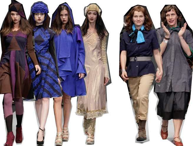
Manhes Massun is a brand made by two female designers, Sophie Massun and Isabel Manhes. Their line is always colorful and for Fall they chose to work with all shades of vibrant blues getting all the way to purple as well as brown and some gold and beige in the last two looks. The brand has always played with colorblocking and that's how this time they combined all the different colors sometimes even making them clash. Most of the collection consisted in dresses of long length, almost all of them below the knee. I like how they choose some mexican inspiration to portray on their work without making the piece feel like a typical mexican costume. This time it came in silk pleated dresses with lace that created a geometrical pattern. The overall silhouette however felt a little akward and though there are great separate pieces some of the dresses themselves wouldn't work in the real world.
Manhes Massun es una marca creada por las diseñadoras Sophie Massun e Isabel Manhes. Su línea es siempre bastante colorida y para otoño decidieron trabajar con muchos azules vibrantes llegando al morado, así como café y beige y dorado para los dos últimos looks. La marca siempre ha jugado con el "colorblocking" y así fué como esta vez combinaron todos los diferentes colores a veces hasta haciendolos chocar. La mayoría de la colección fueron vestidos largos casi todos abajo de la rodilla. De ellas, me gusta como cada colección escogen alguna inspiración mexicana y la trabajan sin que parezca traje tìpico, esta vez se pudo ver en vestidos tableados con encaje vibrante que hacía una especie de dibujo geométrico. La silueta en general estuvo un poco rara y aunque hay muy buenas piezas separadas algunos de esos vestidos no funcionarían mucho en la vida real.
Kris Goyri
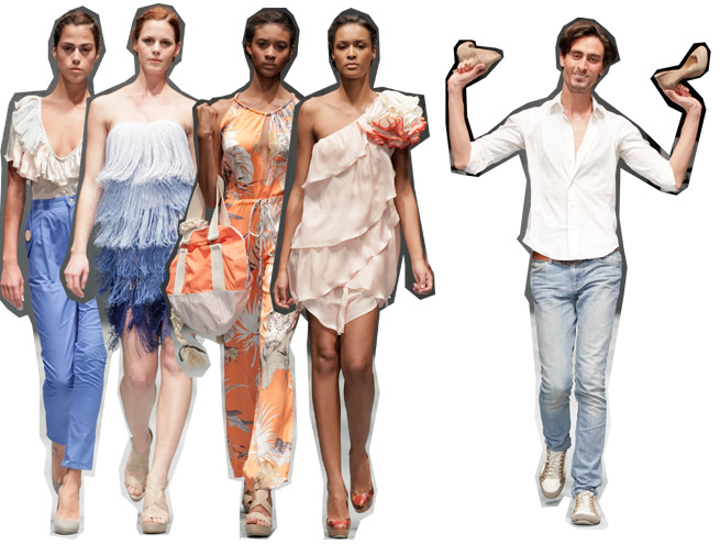
I hadn't heard that much about him, except for an exhibition of his illustrations shown on the past edition of this event. The collection was Kris Goyri Resort, and I'm not sure, if this was a resort collection, then it was a little early o way too late. It was definitely among my few favorites. Kris has an elegant approach and he may not be focused on being groundbreaking, or creating something never seen before, but he sure has great taste and one of the best executions of the bunch. The silhoute was nicely shaped around the body without feling tight in palette of light shades of blue, with ivory, that contrasted with a soft peachy orange. He also had nice prints that included polka dots in shades of brown and orange, a floral one in a blueish-purple background, and a jungle themed one with tigers and palm leaves. His collection was as wearable as it can be but done in a graceful way, and are definitely clothes you want to wear.
No he escuchado mucho de Kris Goyri salvó por una exposición de ilustraciones que presentó en la edición anterior del evento. Ésta colección fué Kris Goyri Resort y no estoy seguro de sí es o no una colección de resort aunque así parece, de serlo fué un poco temprana o demasiado tardía. No importa porque fué de mis favoritas. Kris demostró un enfoque elegante y seguramente no tenía en mente venir a revolucionar la moda ni crear algo que nunca hubieramos visto, de cualquier manera hizo ropa con muy buen gusto y una de las mejores ejecuciones. La silueta de la ropa se ajustaba ligeramente al cuerpo sin sentirse muy ceñida, en una paleta que iba de azules claros, a colores neutros marfíl que se contrastaban a su vez con naranjas durazno. Tambiés cabe destacar que escogió estampados acertadamente, como lunares en tonos naranjas y cafés, florales sobre un fondo azul-morado y uno de tema selvático que tenía tigres y hojas de palmeras. Su colección es ropa que puedes usar pero hecha con clase y que definitivamente se te antoja.
No he escuchado mucho de Kris Goyri salvó por una exposición de ilustraciones que presentó en la edición anterior del evento. Ésta colección fué Kris Goyri Resort y no estoy seguro de sí es o no una colección de resort aunque así parece, de serlo fué un poco temprana o demasiado tardía. No importa porque fué de mis favoritas. Kris demostró un enfoque elegante y seguramente no tenía en mente venir a revolucionar la moda ni crear algo que nunca hubieramos visto, de cualquier manera hizo ropa con muy buen gusto y una de las mejores ejecuciones. La silueta de la ropa se ajustaba ligeramente al cuerpo sin sentirse muy ceñida, en una paleta que iba de azules claros, a colores neutros marfíl que se contrastaban a su vez con naranjas durazno. Tambiés cabe destacar que escogió estampados acertadamente, como lunares en tonos naranjas y cafés, florales sobre un fondo azul-morado y uno de tema selvático que tenía tigres y hojas de palmeras. Su colección es ropa que puedes usar pero hecha con clase y que definitivamente se te antoja.
No hay comentarios:
Publicar un comentario