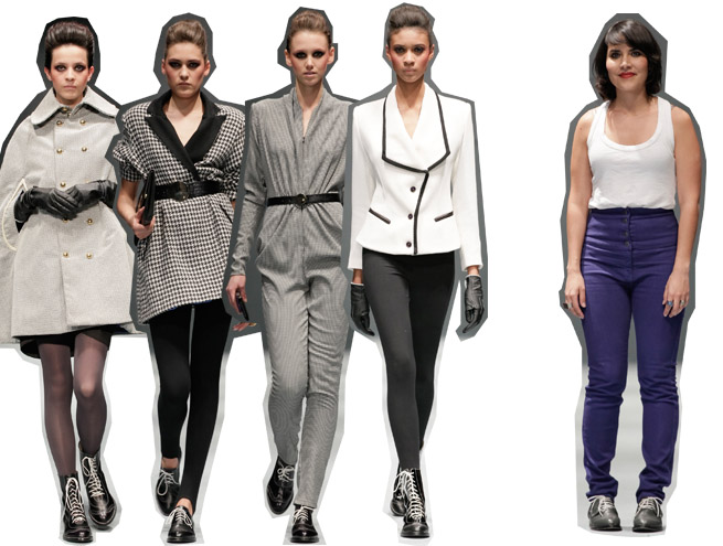
Paola Hernández is now a recognized designer among the fashion scene in México. She has presented collections in Fashion Week Mexico or whatever mexican event we've had for some time now. She has also presented her collections in New York. Her signature are clothes with a vintage feel, inspired by american sportswear of the 30's and the beggining of clothing being industrialized. She always chooses a monochrome range that goes from black to white. This season had nice outerwear options, like capes and all sorts of jackets, some short and fitted and other in a wider more regular cut, that suits all types of bodies. My favorite look was a bodysuit in a very small houndstooth, that was waisted with a tiny black belt. The shoes were pretty nice two, black and two-toned oxfords that often were up in the ankle becoming a bootie. I didn't like however, that some of her creations seemed real vintage. For instance, a jacket in big houndstooth with strong bulky shoulders and black lapels, that was very 80's. It's nice to take inspiration from other times, but it need to feel modern and current. I am intrigued if Paola could break out of this in the future.
Paola Hernández es una diseñadora bastante reconocida en la moda en México. Ha presentado colecciones en los eventos de México así como también en Nueva York. Su estetica es siempre ropa con un aire nostálgico y un poco vintage, inspirada en el "sportswear" americano de los años 30's y el momento de industrialización de la ropa. Siempre escoge paletas monocromáticas que van del negro al blanco. Esta temporada ha creado muy buenas opciones para el frió como capas, chaquetas ajustadas al cuerpo, y otras un poco más amplias y largas que favorecen cualquier tipo de cuerpo. Mi look favorito fue un completo en una pata de gallo muy pequeña que se estilizo con un cinturíon delgado y que se vió bastante moderno. Los zapatos estuvieron tambien muy bien, eran zapatos oxford negros y bicolor (blanco-negro) que en ocasiones se elevaban haciendo botines. A pesar de todo no me gustó que varias prendas parecían vintage en verdad. Por ejemplo, una chaqueta de pata de gallo pero mas grande, con hombros amplios y solapa negra, parecía una prenda real sacada de los 80's. Es válido que usemos inspiración de otras décadas pero debe al mismo tiempo de sentirse actual, moderna. De cualquier manera me intriga lo que hará Paola para la próxima.
Paola Hernández es una diseñadora bastante reconocida en la moda en México. Ha presentado colecciones en los eventos de México así como también en Nueva York. Su estetica es siempre ropa con un aire nostálgico y un poco vintage, inspirada en el "sportswear" americano de los años 30's y el momento de industrialización de la ropa. Siempre escoge paletas monocromáticas que van del negro al blanco. Esta temporada ha creado muy buenas opciones para el frió como capas, chaquetas ajustadas al cuerpo, y otras un poco más amplias y largas que favorecen cualquier tipo de cuerpo. Mi look favorito fue un completo en una pata de gallo muy pequeña que se estilizo con un cinturíon delgado y que se vió bastante moderno. Los zapatos estuvieron tambien muy bien, eran zapatos oxford negros y bicolor (blanco-negro) que en ocasiones se elevaban haciendo botines. A pesar de todo no me gustó que varias prendas parecían vintage en verdad. Por ejemplo, una chaqueta de pata de gallo pero mas grande, con hombros amplios y solapa negra, parecía una prenda real sacada de los 80's. Es válido que usemos inspiración de otras décadas pero debe al mismo tiempo de sentirse actual, moderna. De cualquier manera me intriga lo que hará Paola para la próxima.
Être
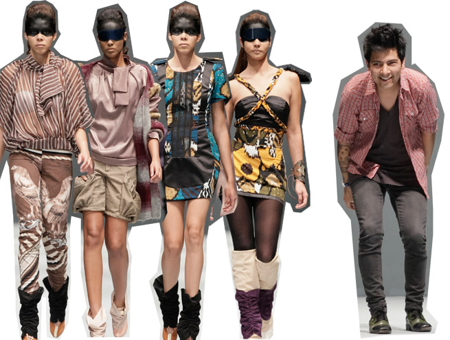
Jose Luis González designs Être, a young and funky brand that has built a reputation in nice short dresses to party but with a nice idea behind them. Each collection is a totally different concept but with a similar approach that makes him recognizeable. This one was a nice journey through colors and prints that reminded me of the visual richness of México. The firts looks were developed in tones of light brown, mauve or toasted pink, combined with pieces in black. In this earthy tones, one of the most interesting prints of the season came out, a image of two roosters with mountains in the background, and wide diagonal stripes that framed it, as minidresses, tops but the best of all were the trousers. Then came two similar tribal prints in different tones, one with blue and the other with green, in a variety of short dresses that had interesting construction and details on the shoulders, thanks to the makeup giving the idea of a softer feminine warrior. The clothes were nice, but some of the outfits had been styled badly, using wide belts that did'nt look as tasteful as the clothes themselves. The tribal prints were as well, a little reminiscent to what Gucci did for Spring.
Jose Luis González diseña para Être, una marca joven y que se ha construido en base a muy buenas opciones para vestidos cortos de fiesta pero con una idea interesante atrás. Cada colección es muy diferente conceptualmente pero con un enfoque similar que hacer a la marca reconocible. Esta me pareció una travesía por México y me recordío a toda la riqueza visual que tenemos. Los primeros looks eran tonos cafés claros, rosas quemados y malva combinados con piezas negras. En estos tonos, salió uno de mis prints favoritos ésta temporada, dos gallos con unas montañas en el fondo y líneas en diagonales que los enmarcabas, fueron minivestidos, tops y lo mejor, pantalones. Despues salieron otros estampados como de inspiración tribal en azul y en verde, muy parecidos entre sí que dieron oportunidad de presentar los vestidos cortos elaborados en formas muy interesantes, casi todos con detalles en los hombros y gracias al maquillaje, me recordaron una especie de guerrera. La ropa estuvo bien pero el styling no me convenció, con el uso de cinturones gruesos que creo que no se veían tan bien como la ropa. Los prints tribales me recordarón mucho a Gucci de primavera.
MalafachaJose Luis González diseña para Être, una marca joven y que se ha construido en base a muy buenas opciones para vestidos cortos de fiesta pero con una idea interesante atrás. Cada colección es muy diferente conceptualmente pero con un enfoque similar que hacer a la marca reconocible. Esta me pareció una travesía por México y me recordío a toda la riqueza visual que tenemos. Los primeros looks eran tonos cafés claros, rosas quemados y malva combinados con piezas negras. En estos tonos, salió uno de mis prints favoritos ésta temporada, dos gallos con unas montañas en el fondo y líneas en diagonales que los enmarcabas, fueron minivestidos, tops y lo mejor, pantalones. Despues salieron otros estampados como de inspiración tribal en azul y en verde, muy parecidos entre sí que dieron oportunidad de presentar los vestidos cortos elaborados en formas muy interesantes, casi todos con detalles en los hombros y gracias al maquillaje, me recordaron una especie de guerrera. La ropa estuvo bien pero el styling no me convenció, con el uso de cinturones gruesos que creo que no se veían tan bien como la ropa. Los prints tribales me recordarón mucho a Gucci de primavera.
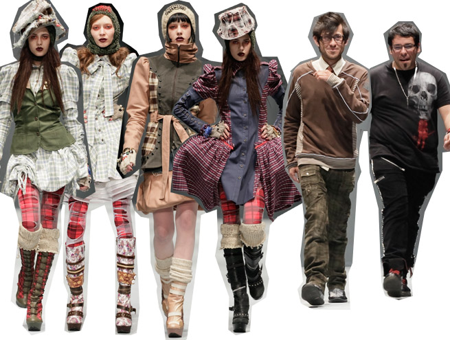
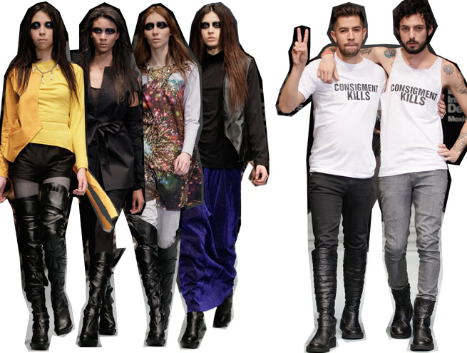
Malafacha is done by Francisco Saldaña and Victor Hernal, their mission is to make clothes that can mix a urban style with wearability, nice separates that could make a statement in your wardrobe but styled during their shows to creater a higher level of drama. That's what the collection for fall embodied, clearly being inspired by this homeless, vagabond style. Their construction was achieved by color-blocking plaid fabrics with plain colors, like blue, red, olive or light peach and blue. This kind of inspiration is perfect for fall since it translates into nice coats and jackets perfect for the season, as well as nice dresses or plaid leggins that would layer for a cool effect. Thanks to the make-up and the head pieces that complemented nicely each look, the show was one of the most dramatic of the bunch. When I started looking through the images of the show I instantly remembered last year's covers of Vogue Italia. It's nice to get inspired by themes that have been done before, and I don't know if they did inspired by the actual magazine, but I couldn't help thinking that the concept has worn out. Hopefully next season would take a different path.
Malafacha la hacen Francisco Saldaña y Victor Hernal, su misión es combinar estilo urbano que al mismo tiempo sea facil de usar, con prendas que por separado portan un buen mensaje y que gracias al styling, el show siempre toma un rumbo mucho más fuerte y dramático. Eso fué lo que personificó la colección para otoño, claremente inspirados por una estetica como de vagabundo. En terminos de construcción telas a cuadros fueron usadas en una especie de "color block" con otras telas en colores solidos como rojo, verde olivo, azul y durazno. Esta clase de inspiración da muy buenos resultados para otoño, porque bien traducida, nos da abrigos, chamarras y chaquetas que pueden ser estilizadas en capas con vestidos y los leggings de cuados, para obtener un efecto interesante. Gracias al maquillaje y los sombreros que fueron buen complemento para cada look, el show fue uno de los mas dramáticos del grupo. Cuando comenze a ver la colección me recordó instantáneamente a las portadas de Vogue Italia del año pasado. Está bien inspirarse por estos temas que ya hemos visto varias veces, no se si se inspirarón de la revista tal cual, pero llegue a pensar que es un tema demasiado usado y ya no tan interesante.


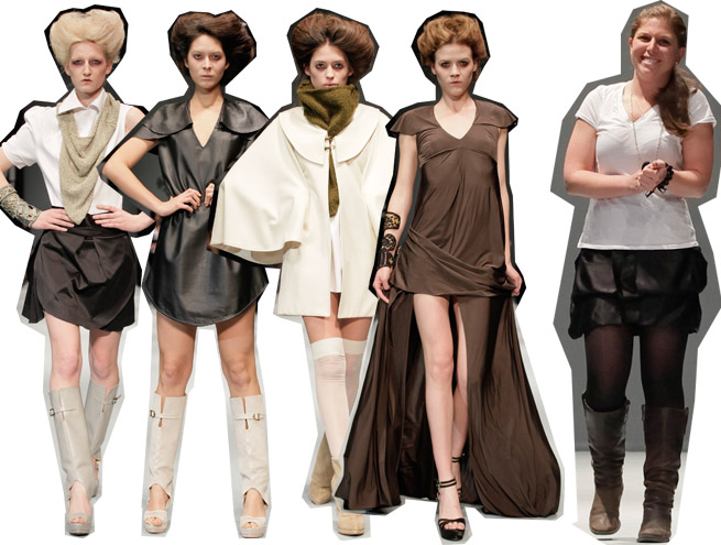
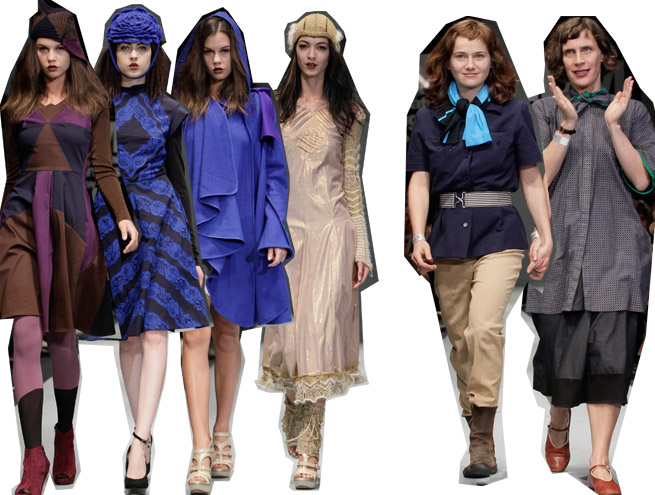
Some of the shows I liked the most came at the end. I've never heard of this designer, so I went through her collection without any previous reference. I came across a Fall collection done in neutrals as most of the designers are doing for Fall; black, white, beige, navy and brown. The clothes were interestingly wearable, with an eye that feels very modern and true to what it's really going down right know in the industry worldwide, reinventing classics and making lasting pieces. Her options for white shirts, skirts dresses and capes felt new and clean in their design. She also used leather as a daywear option, making it into dresses, something that would be everywhere for Fall. This collection felt right not just for youth but for a wider range of age, having things that could be worn by an 18 year old, or her mother and would look nice on both. Some variety was missing in the collection, like more trousers or jackets, but it was a nice collection and I hope she stays true to her aesthethic and also creates something nice for Spring.
Algunos de los desfiles que mas me gustaron llegaron al último. No había escuchado antes de Lorena Saravia, así que revisé su colección sin tener ninguna referencia pasada. Me encontré con una colección de otoño hecha en colores neutrales: azúl, café, blanco, negro y beige. La ropa fue interesante pero al mismo tiempo fácil de usar, con un ojo que se siente moderno y además apegado a las tendencias internacionales que ha estado tomando la industria, o sea, reinventar clásicos y hacer prendas que no pasen de moda. También uso la piel en minivestidos como una opción para el día, algo que creo que estará en todos lados para otoño. La colección se siente hecha para un amplio rango de edad, igual le queda a una chava de 18 años que a su mamá. En términos generales fue muy buena pero me gustaria verle mas variedad, espero que para primavera se mantenga fiel a este estilo y siga haciendo algo interesante.
Daniel Andrade

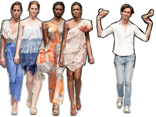
I had also never heard of Daniel Andrade. For Fall his collection was a journey, the hability of going through without loosing part of yourself, or something like that. So it was translated to clothes that felt inspired by travel, think of a very modern Julie Andres-Sound of Music leaving Austria. It had nothing costume as my reference may sound. The colors were very sophisticated and so were the sharp geometrical cuts of the garmets that had a tough feeling but thanks to the details, like soft fabrics that came out of a dress, a flower attached to another one, some ruffles, and a nice play with silk on blouses, the balance between hard and soft was perfect. His garmets felt powerful and new. They may be for youth and younger adult women, but it weren't tacky or vulgar at all. The last looks were definitely the strongest and my favorite dresses of the season, red, blue and green fabrics where dyed as if they have been spotted with chlorine creating somewhat a print. then managed into short dresses with long front zippers, that weren't tight to the body but felt very flattering, the inserts of a softer fabric in a contrasting color covered a shoulder on just sat from the waist to the hip. It was a nice achieved show that proved great design hability and a better execution.
Tampoco había escuchado de Daniel Andrade. Para otoño su colección fue un viaje, donde exista la habilidad de continuar sin dejar parte de tí en cada lugar, o algo así. En cuanto a ropa, se tradujo en algo inspirado en ropa de viaje, un tipo La Novicia Rebelde cruzando a Austria pero moderno. No hay nada de disfraz aunque mi referencia lo pueda hacer parecer así. Los colores fueron muy sofisticados igual que los agudos cortes un poco geométricos en las prendas que daban a veces un aspecto rudo, de cualquier manera se logró suavizar gracias a la tela que salía de los vestidos y flotaba, así como una flor que estaban colocada de manera estratégica, volantes y juego con la seda de las blusas que caía con gracia. Las prendas fueron poderosas y nuevas. Probablemente una línea destinada a las jóvenes y digamos que las adultas jóvenes, de cualquier manera no hay nada vulgar ni cursi en su colección. Los últimos vestidos definitivamente, fueron los mejores, en rojo verde y azul con zippers largos en el frente, creó un efecto en las telas como goteadas por cloro que parecía un estampado, las telas mas suaves contrastaban los vestidos cubriendo un hombro o saliendo de la cintura hacia la cadera. Fue un buen desfile que probó gran sensibilidad hacia el diseño y una muy buena ejecución.
Judging by the shows alone, México has a nice range of designers each doing their own thing, and some of them prove the hability to be at better places. I just think they need people with jobs that are only created once that the foundation of the industry has been firmly reached, and are consultants and better stylists. The weakness of the shows could be easily fixed by having other eye that their own that helps them edit and without compromising their vision create something that would make their collections richer. That consultant task would be if a designer can afford one, the job of the media. In every fashion capital , the designers showcase their work to the few editors or voguettes which gives feedback, and sometimes could make a designer create a more solid collection. That and the media support to cover events like this it's what would make a designer get known and people into the stores to buy them.
Juzgando únicamente por los desfiles, creo que tenemos una buena gama de diseñadores, cada uno con un fuerte punto de vista y algunos con maestría suficiente para estar en mejores lugares. Creo que se necesitan personas que la industria crea una vez que los fundamentos de ella se han afianzado y son consultores y mejores coordinadores de moda. La debilidad de los shows pueden ser arreglados si existe un ojo exterior que les ayude a editar sin comprometer la visión del creador, para que sus colecciónes queden más completas. Ese trabajo de consultoría, debería ser en caso extremos de los medios. En todas las capitales del mundo los diseñadores muestran su labor a algun editor o voguette de confianza que les su reacción y puede ayudarles a hacer la colección más sólida. Tambien se necesita que los medios cubran a los diseñadores y este tipo de eventos, porque así es como a la gente se le antoja entrar a las tiendas a comprar.
Algunos de los desfiles que mas me gustaron llegaron al último. No había escuchado antes de Lorena Saravia, así que revisé su colección sin tener ninguna referencia pasada. Me encontré con una colección de otoño hecha en colores neutrales: azúl, café, blanco, negro y beige. La ropa fue interesante pero al mismo tiempo fácil de usar, con un ojo que se siente moderno y además apegado a las tendencias internacionales que ha estado tomando la industria, o sea, reinventar clásicos y hacer prendas que no pasen de moda. También uso la piel en minivestidos como una opción para el día, algo que creo que estará en todos lados para otoño. La colección se siente hecha para un amplio rango de edad, igual le queda a una chava de 18 años que a su mamá. En términos generales fue muy buena pero me gustaria verle mas variedad, espero que para primavera se mantenga fiel a este estilo y siga haciendo algo interesante.
Daniel Andrade
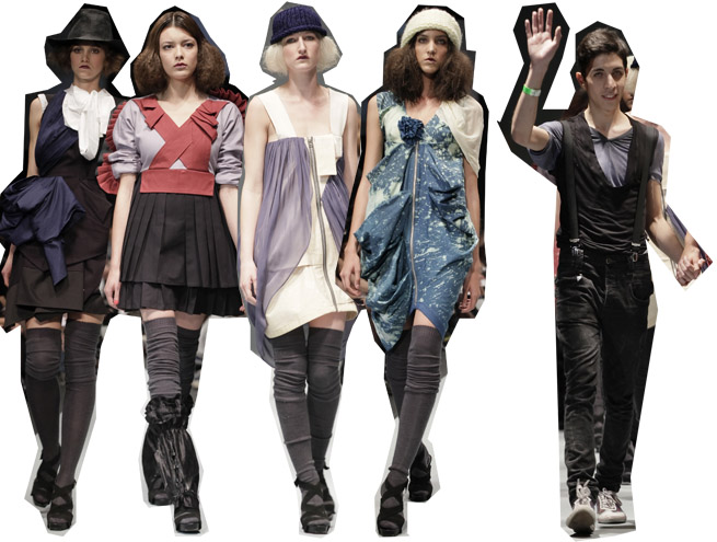
Tampoco había escuchado de Daniel Andrade. Para otoño su colección fue un viaje, donde exista la habilidad de continuar sin dejar parte de tí en cada lugar, o algo así. En cuanto a ropa, se tradujo en algo inspirado en ropa de viaje, un tipo La Novicia Rebelde cruzando a Austria pero moderno. No hay nada de disfraz aunque mi referencia lo pueda hacer parecer así. Los colores fueron muy sofisticados igual que los agudos cortes un poco geométricos en las prendas que daban a veces un aspecto rudo, de cualquier manera se logró suavizar gracias a la tela que salía de los vestidos y flotaba, así como una flor que estaban colocada de manera estratégica, volantes y juego con la seda de las blusas que caía con gracia. Las prendas fueron poderosas y nuevas. Probablemente una línea destinada a las jóvenes y digamos que las adultas jóvenes, de cualquier manera no hay nada vulgar ni cursi en su colección. Los últimos vestidos definitivamente, fueron los mejores, en rojo verde y azul con zippers largos en el frente, creó un efecto en las telas como goteadas por cloro que parecía un estampado, las telas mas suaves contrastaban los vestidos cubriendo un hombro o saliendo de la cintura hacia la cadera. Fue un buen desfile que probó gran sensibilidad hacia el diseño y una muy buena ejecución.
Judging by the shows alone, México has a nice range of designers each doing their own thing, and some of them prove the hability to be at better places. I just think they need people with jobs that are only created once that the foundation of the industry has been firmly reached, and are consultants and better stylists. The weakness of the shows could be easily fixed by having other eye that their own that helps them edit and without compromising their vision create something that would make their collections richer. That consultant task would be if a designer can afford one, the job of the media. In every fashion capital , the designers showcase their work to the few editors or voguettes which gives feedback, and sometimes could make a designer create a more solid collection. That and the media support to cover events like this it's what would make a designer get known and people into the stores to buy them.
Juzgando únicamente por los desfiles, creo que tenemos una buena gama de diseñadores, cada uno con un fuerte punto de vista y algunos con maestría suficiente para estar en mejores lugares. Creo que se necesitan personas que la industria crea una vez que los fundamentos de ella se han afianzado y son consultores y mejores coordinadores de moda. La debilidad de los shows pueden ser arreglados si existe un ojo exterior que les ayude a editar sin comprometer la visión del creador, para que sus colecciónes queden más completas. Ese trabajo de consultoría, debería ser en caso extremos de los medios. En todas las capitales del mundo los diseñadores muestran su labor a algun editor o voguette de confianza que les su reacción y puede ayudarles a hacer la colección más sólida. Tambien se necesita que los medios cubran a los diseñadores y este tipo de eventos, porque así es como a la gente se le antoja entrar a las tiendas a comprar.